iQuote Manager
Case study for the iQuote Manager – an all-in-one solar sales platform.
ALL-IN-ONE SOLAR SALES PLATFORM
In 2016, Sungevity transformed into a platform company for solar – offering software to large and small-scale solar providers. I was part of a project to redesign the complex sales software into a slim, all-in-one sales tool.
My Role
I worked as the user experience designer for the sales experience at Sungevity. I collaborated with a product manager, business process expert, engineers, and executive stakeholders within the company to streamline the sales process and design a customized Salesforce interface to facilitate sales user to customer interaction.
System Combining Multiple Roles
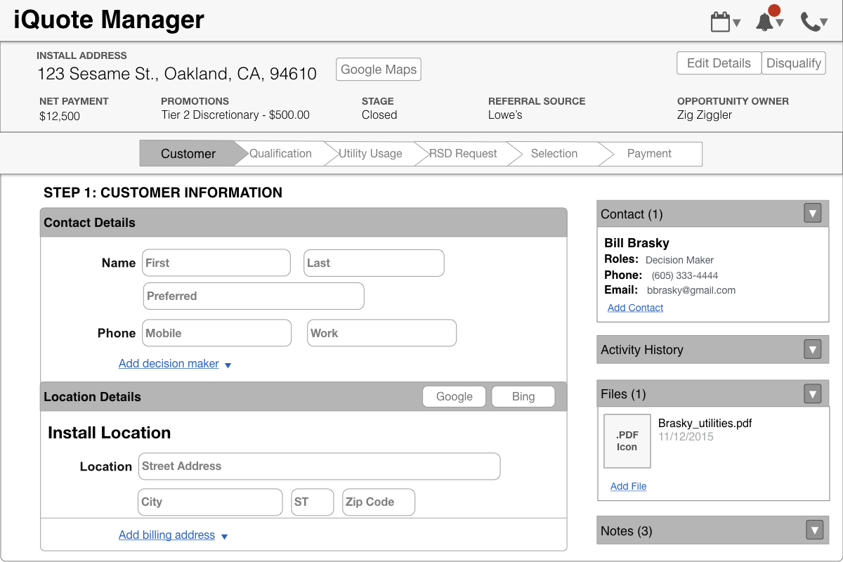
The iQuote Manager combines multiple sales user roles into a single interface with a focus on developing a strong customer rapport while increasing user efficiency. The software consolidates third party applications and required customer data into an intuitive sales flow.
The Sungevity Sales Experience
At the start of my time at Sungevity, I worked with members of the organization to draft a journey map of the Sungevity experience in order to help clarify all the existing and potential touchpoints. I used this map on a variety of projects to help understand the relationships between departments, and to develop deeper empathy for the Sungevity customer.
Customer Journey Map of the Sungevity experience
Task Flow Breakdown
One of the initial steps in the process was to meet with internal experts to document and develop a visual flow of the entire sales process. The structural framework was used to ensure all critical information and steps were accounted for, in order to make the transition as seamless as possible.
Information Architecture
With a holistic picture of the sales process documented, I was able to develop a content inventory of all the required inputs, buttons, and third party applications. Categorizing the content to meet the mental models held by our sales users was crucial, so I created a card sort and worked directly with our users to develop a structural framework.
UI Sketches
Once the basic information architecture was drafted, I sketched basic UI layouts with a focus on the navigational structure of the page. Early user interviews and observational studies revealed a need for flexible navigation in order to support customer conversations. I created a series of sketches depicting different navigation patterns.
Paper Prototyping
In order to test the information architecture and navigation patterns, I created paper prototypes out of individual UI components. I drafted sales scenarios and had our sales users work through tasks with the paper prototypes. This revealed gaps in the architecture, and allowed us to iterate on the UI in real time through participatory design.
Interactive Prototype
I used a combination of Sketch and Invision to draft a lightweight, clickable prototype for additional user review. The goal was to ensure the navigation pattern and flow facilitated the sales process, details were in the right place at the right time, and global versus localized information was effectively surfaced.
Engineering Specifications
I partnered closely with a product manager and the engineering team to communicate the interactive parts of the design. Keeping an open dialogue with the team after initial handoff was key in order to ensure the intended product experience and framework was delivered across multiple companies.
Final Implementation & Outcome
Our initial pilot of the product allowed us to sweat the details and make quick re-designs where testing revealed gaps. Our version 1 rollout immediately eliminated multiple days of training new users to our process, and consolidated the number of users required to complete tasks.
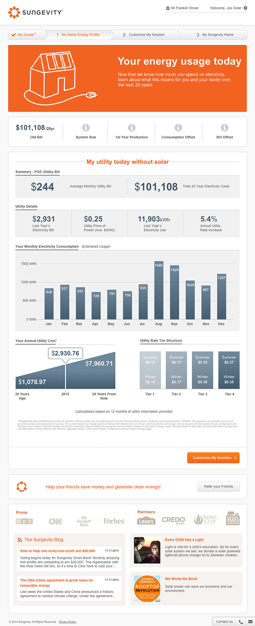
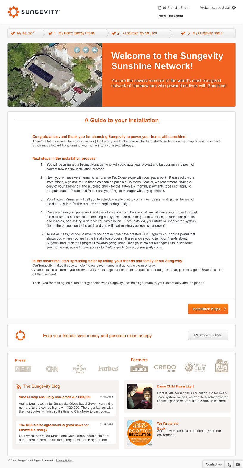
Customer-Facing Sales Tool
Results
20% reduction in sales training time
“Very user friendly! Every click at your finger tip.”
“The new iQuote Manager offers greater and easier visibility into what we need to see. It is simple and intuitive.”
“So much more simple, efficient, and refreshing.”


